Sea Rise Science
Few places on the planet will be impacted by global warming and the resulting sea level rise as much as South Florida. In fact, some predictions suggest that over the next several decades much of what we know of Miami Dade County and Monroe County today will be gone forever. As Rolling Stone Magazine announced, much of South Florida could become a modern day Atlantis. The impact of sea level rise is already being felt all over South Florida. In Miami Beach, for example, Alton Road and many other streets on South Beach have become routinely flooded in recent years at peak high tides that push sea water into local homes and businesses. |
SIGN UP |
|
The streets themselves become covered with salt water from the ocean and are rendered un-useable. To attempt to reverse the current impacts of sea rise the City of Miami Beach has been at the forefront of taking action through infrastructure improvements to local roads, sidewalks and drains by installing a unique pumping system designed to push the salt water back out to sea; a project whose initial cost is estimated at $450 million dollars. And yet, as crippling as this problem has been to the community of Miami Beach and our region, they have only begun to feel the very initial stages of the devastation and destruction that is likely to come in the decades ahead. And to be clear, the threat of sea level rise threatens far more than the edge of our coast or its barrier islands. At risk is trillions of dollars of existing infrastructure, buildings, and improvements that in some cases have existed for a century or more. Also at risk are human habitat, people’s lifestyles, tax revenue and industries such as tourism and agriculture, as well as countless animals and the habitats in which they live in. And because of the porous nature of South Florida’s geology, the threat of sea level rise is not only confined to those areas on or near the water, but those that are inland as well. As the seas rise, so too will the water under our state, up and through our porous limestone and into lands all the way to, and even through, the Everglades to our west. Few places on the planet are more at risk to the threat of sea level rise than South Florida, and it is for that reason that the Sink or Swim project exists, including this website that you are looking at today. Because of the risks that our region faces, local governments and leaders have been forced to begin analyzing the problem at a time when much of the country is unaware of what lies ahead and when politics, or entire industries, attempt to make solving the issue challenging. If you want to learn about sea level rise here in South Florida, chances are good that you’ll find what you’re looking for here. From government planning documents that outline the threat that sea level rise presents to our communities, as well as possible solutions, to articles of interest and other materials on the topic, it’s here to help you learn and to become engaged. Most of the scientific data, graphs, charts, and commentary, are from the 2013 and 2014 IPCC Climate Change Work Groups I and II as published by Cambridge Press. These books are nearly 5,000 pages long and summarize the incredibly important work by tens of thousands of scientists, authors, contributing authors, and editors from around the world. Other sources of data include the Environmental Protection Agency, the Department of Environmental Protection, NASA, as well as interviews conducted with local, scientific thought leaders and their research.
|
|


Our Warming Planet

Sources of Global WarmingAs this illustration depicts, the Earth’s climate system is powered by solar radiation. The radiative balance between incoming solar shortwave radiation (SWR) and outgoing longwave radiation (OLR) is influenced by global climate ‘drivers’. Natural fluctuations in solar output (solar cycles) can cause changes in the energy balance (through fluctuations in the amount of incoming SWR) (Section 2.3). Human activity changes the emissions of gases and aerosols, which are involved in atmospheric chemical reactions, resulting in modified O3 and aerosol amounts (Section 2.2). O3 and aerosol particles absorb, scatter and reflect SWR, changing the energy balance. Some aerosols act as cloud condensation nuclei modifying the properties of cloud droplets and possibly affecting precipitation (Section 7.4). Because cloud interactions with SWR and LWR are large, small changes in the properties of clouds have important implications for the radiative budget (Section 7.4). Anthropogenic changes in GHGs (e.g., CO2, CH4, N2O, O3, CFCs) and large aerosols (>2.5 μm in size) modify the amount of outgoing LWR by absorbing outgoing LWR and re-emitting less energy at a lower temperature (Section 2.2). Surface albedo is changed by changes in vegetation or land surface properties, snow or ice cover and ocean color (Section 2.3). These changes are driven by natural seasonal and diurnal changes (e.g., snow cover), as well as human influence (e.g., changes in vegetation types) (Forster et al., 2007). As the Earth’s temperature has been relatively constant over many centuries, the incoming solar energy must be nearly in balance with outgoing radiation. Of the incoming solar shortwave radiation (SWR), about half is absorbed by the Earth’s surface. The fraction of SWR reflected back to space by gases and aerosols, clouds and by the Earth’s surface (albedo) is approximately 30%, and about 20% is absorbed in the atmosphere. Based on the temperature of the Earth’s surface the majority of the outgoing energy flux from the Earth is in the infrared part of the spec¬trum. The longwave radiation (LWR, also referred to as infrared radiation) emitted from the Earth’s surface is largely absorbed by certain atmospheric constituents—water vapor, carbon dioxide (CO2), methane (CH4), nitrous oxide (N2O) and other greenhouse gases (GHGs); see Annex III for Glossary—and clouds, which themselves emit LWR into all directions. The downward directed component of this LWR adds heat to the lower layers of the atmosphere and to the Earth’s surface (greenhouse effect). The dominant energy loss of the infrared radiation from the Earth is from higher layers of the troposphere. The Sun provides its energy to the Earth primarily in the tropics and the subtropics; this energy is then partially redistributed to middle and high latitudes by atmospheric and oceanic transport processes. Source: CLIMATE CHANGE 2013: THE PHYSICAL SCIENCE BASICS, Working Group I Contribution To The Fifth Assessment Report of the Intergovernmental Panel on Climate Change, Cambridge University Press, 2014 |
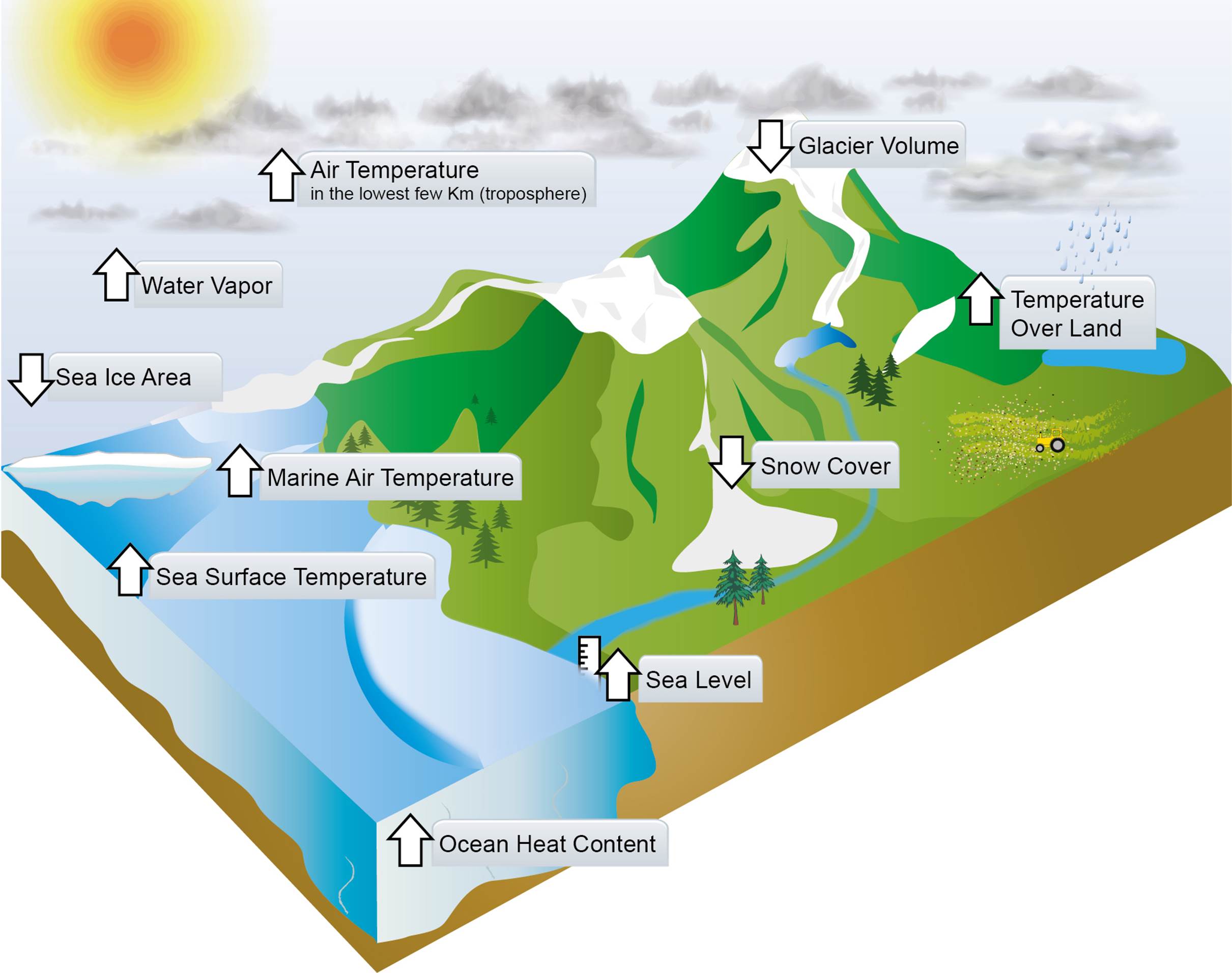
How Scientist Know That Earth Has WarmedEvidence for a warming world comes from multiple independent climate indicators, from high up in the atmosphere to the depths of the oceans. They include changes in surface, atmospheric and oceanic temperatures; glaciers; snow cover; sea ice; sea level and atmospheric water vapor. Scientists from all over the world have independently verified this evidence many times. That the world has warmed since the 19th century is unequivocal. Discussion about climate warming often centers on potential residual biases in temperature records from land-based weather stations. These records are very important, but they only represent one indicator of changes in the climate system. Broader evidence for a warming world comes from a wide range of independent physically consistent measurements of many other, strongly interlinked, elements of the climate system (FAQ 2.1, Figure 1). A rise in global average surface temperatures is the best-known indicator of climate change. Although each year and even decade is not always warmer than the last, global surface temperatures have warmed substantially since 1900. Warming land temperatures correspond closely with the observed warming trend over the oceans. Warming oceanic air temperatures, measured from aboard ships, and temperatures of the sea surface itself also coincide, as borne out by many independent analyses. The atmosphere and ocean are both fluid bodies, so warming at the surface should also be seen in the lower atmosphere, and deeper down into the upper oceans, and observations confirm that this is indeed the case. Analyses of measurements made by weather balloon radiosondes and satellites consistently show warming of the troposphere, the active weather layer of the atmosphere. More than 90% of the excess energy absorbed by the climate system since at least the 1970s has been stored in the oceans as can be seen from global records of ocean heat content going back to the 1950s. As the oceans warm, the water itself expands. This expansion is one of the main drivers of the independently observed rise in sea levels over the past century. Melting of glaciers and ice sheets also contribute, as do changes in storage and usage of water on land. A warmer world is also a moister one, because warmer air can hold more water vapor. Global analyses show that specific humidity, which measures the amount of water vapor in the atmosphere, has increased over both the land and the oceans. The frozen parts of the planet—known collectively as the cryosphere—affect, and are affected by, local changes in temperature. The amount of ice contained in glaciers globally has been declining every year for more than 20 years, and the lost mass contributes, in part, to the observed rise in sea level. Snow cover is sensitive to changes in temperature, particularly during the spring, when snow starts to melt. Spring snow cover has shrunk across the NH since the 1950s. Substantial losses in Arctic sea ice have been observed since satellite records began, particularly at the time of the minimum extent, which occurs in September at the end of the annual melt season. By contrast, the increase in Antarctic sea ice has been smaller. Individually, any single analysis might be unconvincing, but analysis of these different indicators and independent data sets has led many independent research groups to all reach the same conclusion. From the deep oceans to the top of the troposphere, the evidence of warmer air and oceans, of melting ice and rising seas all points unequivocally to one thing: the world has warmed since the late 19th century. Independent analyses of many components of the climate system that would be expected to change in a warming world exhibit trends consistent with warming (arrow direction denotes the sign of the change). Source: CLIMATE CHANGE 2013: THE PHYSICAL SCIENCE BASICS, Working Group I Contribution To The Fifth Assessment Report of the Intergovernmental Panel on Climate Change, Cambridge University Press, 2014 |
CO2 & Greenhouse Gas Growth in our Atmosphere
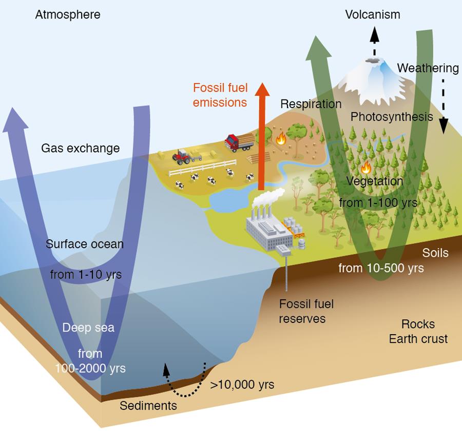
What CO2 Does When It’s Released Into Our Atmosphere: The Global Carbon CycleWhere does the carbon dioxide (CO2) from all sorts of fossil fuel use and cement production go? Into our atmosphere. Into the air above us, the ground under our feet and the oceans all over the planet. CO2 is a dirty, dangerous, chemical that is at the heart of our warming planet and rising seas. Understanding where it goes, and how long it’s around Earth once it’s produced is important to understand if we as a society are ever going to slow warming and sea rise. Here’s a small summary of how the scientist from the latest IPCC Report explain carbon’s impact in what is called The Global Carbon Cycle. Carbon dioxide (CO2), after it is emitted into the atmosphere, is firstly rapidly distributed between atmosphere, the upper ocean and vegetation. Subsequently, the carbon continues to be moved between the different reservoirs of the global carbon cycle, such as soils, the deeper ocean and rocks. Some of these exchanges occur very slowly. Depending on the amount of CO2 released, between 15% and 40% will remain in the atmosphere for up to 2000 years, after which a new balance is established between the atmosphere, the land biosphere and the ocean. Geological processes will take anywhere from tens to hundreds of thousands of years—perhaps longer—to redistribute the carbon further among the geological reservoirs. Higher atmospheric CO2 concentrations, and associated climate impacts of present emissions, will, therefore, persist for a very long time into the future. CO2 is a largely non-reactive gas, which is rapidly mixed throughout the entire troposphere in less than a year. Unlike reactive chemical compounds in the atmosphere that are removed and broken down by sink processes, such as methane, carbon is instead redistributed among the different reservoirs of the global carbon cycle and ultimately recycled back to the atmosphere on a multitude of time scales. The diagram here shows a simplified diagram of the global carbon cycle. The open arrows indicate typical timeframes for carbon atoms to be transferred through the different reservoirs. Before the Industrial Era, the global carbon cycle was roughly balanced. This can be inferred from ice core measurements, which show a near constant atmospheric concentration of CO2 over the last several thousand years prior to the Industrial Era. Anthropogenic emissions of carbon dioxide into the atmosphere, however, have disturbed that equilibrium. As global CO2 concentrations rise, the exchange processes between CO2 and the surface ocean and vegetation are altered, as are subsequent exchanges within and among the carbon reservoirs on land, in the ocean and eventually, the Earth crust. In this way, the added carbon is redistributed by the global carbon cycle, until the exchanges of carbon between the different carbon reservoirs have reached a new, approximate balance. Over the ocean, CO2 molecules pass through the air-sea interface by gas exchange. In seawater, CO2 interacts with water molecules to form carbonic acid, which reacts very quickly with the large reservoir of dissolved inorganic carbon—bicarbonate and carbonate ions—in the ocean. Currents and the formation of sinking dense waters transport the carbon between the surface and deeper layers of the ocean. The marine biota also redistribute carbon: marine organisms grow organic tissue and calcareous shells in surface waters, which, after their death, sink to deeper waters, where they are returned to the dissolved inorganic carbon reservoir by dissolution and microbial decomposition. A small fraction reaches the sea floor, and is incorporated into the sediments. Because of ocean chemistry the size of the initial input is important: higher emissions imply that a larger fraction of CO2 will remain in the atmosphere. After 2000 years, the atmosphere will still contain between 15% and 40% of those initial CO2 emissions. A further reduction by carbonate sediment dissolution, and reactions with igneous rocks, such as silicate weathering and sediment burial, will take anything from tens to hundreds of thousands of years, or even longer. Source: CLIMATE CHANGE 2013: THE PHYSICAL SCIENCE BASICS, Working Group I Contribution To The Fifth Assessment Report of the Intergovernmental Panel on Climate Change, Cambridge University Press, 2014 |

US Temperature ChangeThe colors on the map show temperature changes over the past 22 years (1991-2012) compared to the 1901 – 1960 average, and compared to the 1951 – 1980 average for Alaska and Hawaii. The bars on the graphs show the average temperature changes by decade for 1901 – 2012 for each region. The far right bar in each graph includes 2011 and 2012. The period from 2001 to 2012 was warmer than any previous decade in every region. |

Green House Gas GraphThis graph shows which gases account for how much of the pollution is causing global warming in the listed part. The circle part shows where they come from, also known as areas we can improve, such as more efficient power sources since electrical generation accounts, as an industry, for 32% of all greenhouse gas, and transportation (such as shipping and trucking) for 28%. Carbon Dioxide commonly comes from the exhaust fumes found in cars, trucks, and factories. Fluorinated gases are emitted from industrial processes. They do not damage the atmospheric ozone layer, but they do have a global warming effect up to 23,000 times greater than carbon dioxide. Nitrous Oxide is emitted during agricultural and industrial activities, as well as during combustion of fossil fuels and solid waste. Methane is emitted during the production and transport of coal, natural gas, and oil as well as from landfills. Source: this is the source |
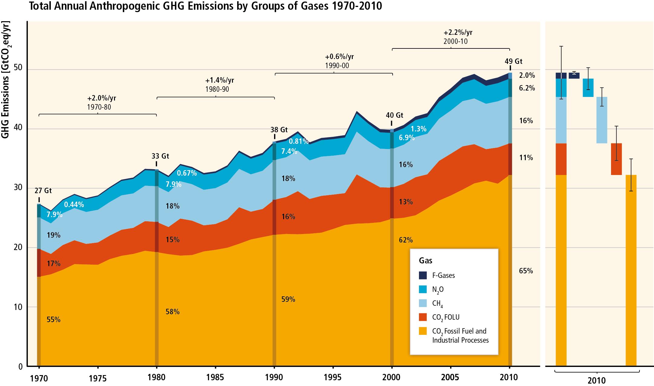
Which Gases Comprise Greenhouse Gases And How Do They Grow In Our Atmosphere Over Time?There is a lot of science in this chart but what it mainly depicts is which cases make up what are commonly called ‘greenhouse gases’. According to the IPCC Greenhouse gases are those gaseous constituents of the atmosphere, both natural and anthropogenic, that absorb and emit radiation at specific wavelengths within the spectrum of terrestrial radiation emitted by the earth’s surface, the atmosphere itself, and by clouds. This property causes the greenhouse effect. Water vapour (H2O), carbon dioxide (CO2), nitrous oxide (N2O), methane (CH4) and ozone (O3) are the primary GHGs in the earth’s atmosphere. There are also a number of entirely human-made GHGs in the atmosphere, such as the halocarbons and other chlorine- and bromine containing CO2, N2O and CH4, the Kyoto Protocol deals with the GHGs sulphur hexafluoride (SF6), hydrofluorocarbons (HFCs) and perfluorocarbons (PFCs). In addition to the sources of the gases one of the fascinating things about this chart is that it also depicts growth rates of greenhouse gases and illustrates the average annual growth rates for the four decades are highlighted with the brackets at the top of the chart. The average annual growth rate from 1970 to 2000 is 1.3 %. Total annual anthropogenic GHG emissions (GtCO2eq / yr) by groups of gases 1970 – 2010: carbon dioxide (CO2) from fossil fuel combustion and industrial processes; CO2 from Forestry and Other Land Use4 (FOLU); methane (CH4); nitrous oxide (N2O); fluorinated gases5 covered under the Kyoto Protocol (F-gases). At the right side of the figure, GHG emissions in 2010 are shown again broken down into these components with the associated uncertainties (90 % confidence interval) indicated by the error bars. Total anthropogenic GHG emissions uncertainties are derived from the individual gas estimates as described in Chapter 5 of the IPCC AR5 report in 2014. Emissions are converted into CO2-equivalents based on Global Warming Potentials with a 100-year time horizon (GWP100) from the IPCC Second Assessment Report (SAR). The emissions data from FOLU represents land-based CO2 emissions from forest and peat fires and decay that approximate to the net CO2 flux from FOLU as described in the IPCC report. Average annual GHG emissions growth rates for the four decades are highlighted with the brackets. The average annual growth rate from 1970 to 2000 is 1.3 %. Source: CLIMATE CHANGE 2014: MITIGATION OF CLIMTE CHANGE, Working Group III Contribution To The Fifth Assessment Report of the Intergovernmental Panel on Climate Change, Cambridge University Press, 2014 |
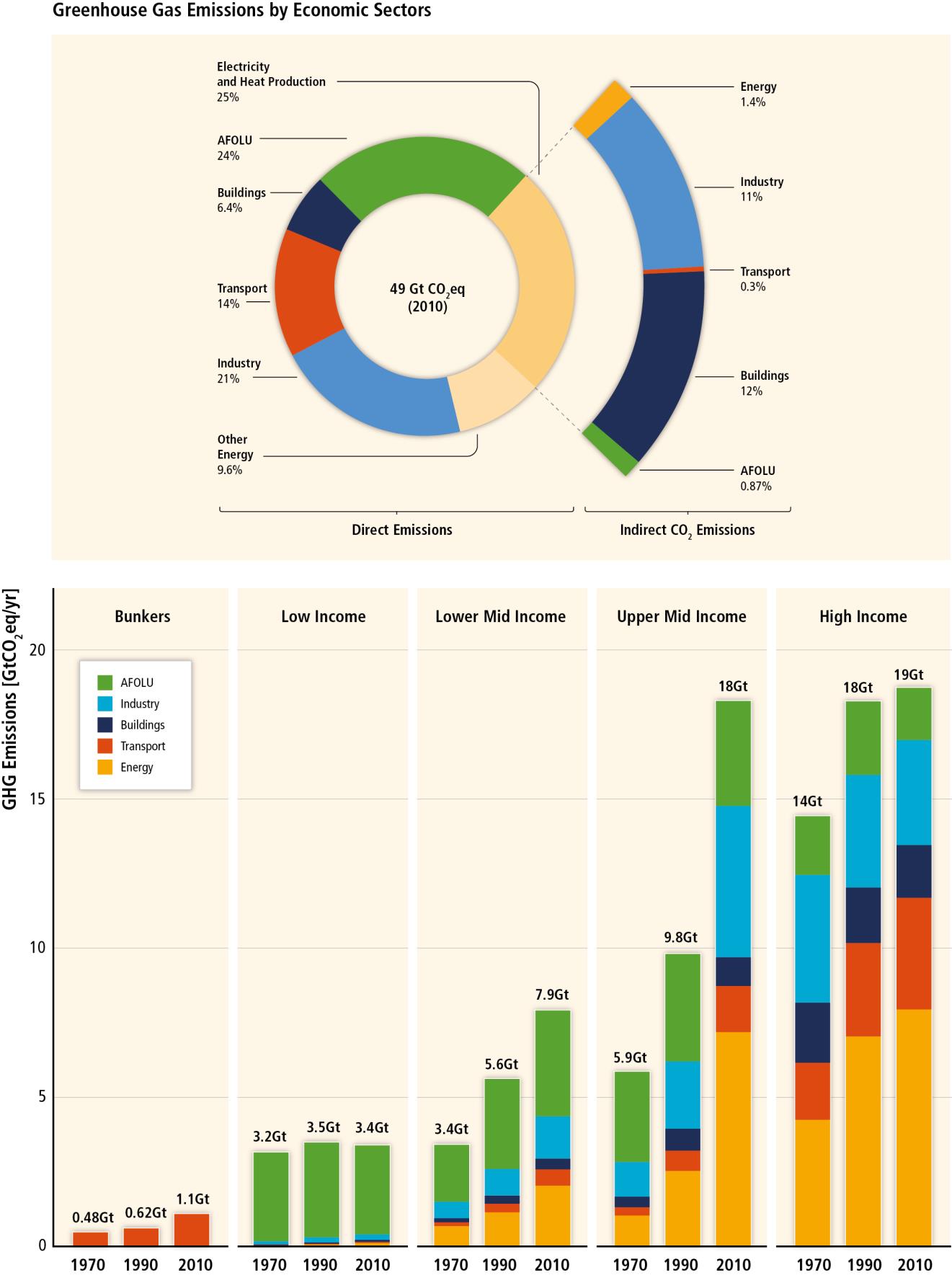
Where Do Greenhouse Gases Come From?The circle on top of this illustration shows which economic sectors most contribute directly (in the circle) and indirectly (the section of the graph from electrical and heat production) to greenhouse gases. The bar chart at the bottom of the illustration illustrates the source of greenhouse gas by economic sector. Circle shows direct GHG emission shares (in % of total anthropogenic GHG emissions) of five major economic sectors in 2010. Pull-out shows how indirect CO2 emission shares (in % of total anthropogenic GHG emissions) from electricity and heat production are attributed to sectors of final energy use. ‘Other Energy’ refers to all GHG emission sources in the energy sector other than electricity and heat production. Lower panel: Total anthropogenic GHG emissions in 1970, 1990 and 2010 by five major economic sectors and country income groups. ‘Bunkers’ refer to GHG emissions from international transportation and thus are not, under current accounting systems, allocated to any particular nation’s territory. The emissions data from Agriculture, Forestry and Other Land Use (AFOLU) includes land-based CO2 emissions from forest and peat fires and decay that approximate to the net CO2 flux from the Forestry and Other Land Use (FOLU) sub-sector as described in Chapter 11 of the IPCC report. Emissions are converted into CO2-equivalents based on Global Warming Potentials with a 100-year time horizon (GWP100) from the IPCC Second Assessment Report (SAR). Assignment of countries to income groups is based on the World Bank income classification in 2013. Source: CLIMATE CHANGE 2014: MITIGATION OF CLIMTE CHANGE, Working Group III Contribution To The Fifth Assessment Report of the Intergovernmental Panel on Climate Change, Cambridge University Press, 2014 |

Observed Global Average Combined Land & Ocean Surface Temperature Anomaly 1850 to 2012The first chart (a) illustrates how earth’s temperatures have warmed each year from 1850 through 2012. The second chart illustrates how the earth’s temperature have changed between 1901 – 2012 and, as you can see from the key below the map, he majority of earth’s surface has become warmer, by as much as 2.5 degrees. There are two charts here, (a), which illustrates the actual, observed, land and sea mean temperature values from 1850 through 2012 and (b), which looks at how the earth’s temperature has changed between 1901 and 2012. (a) Observed global mean combined land and ocean surface temperature anomalies, from 1850 to 2012 from three data sets. Top panel: annual mean values. Bottom panel: decadal mean values including the estimate of uncertainty for one dataset (black). Anomalies are relative to the mean of 1961−1990. (b) Map of the observed surface temperature change from 1901 to 2012 derived from temperature trends determined by linear regression from one dataset (orange line in panel a). Trends have been calculated where data availability permits a robust estimate (i.e., only for grid boxes with greater than 70% complete records and more than 20% data availability in the first and last 10% of the time period). Other areas are white. Grid boxes where the trend is significant at the 10% level are indicated by a + sign. For a listing of the datasets and further technical details see the Technical Summary Supplementary Material. {Figures 2.19–2.21; Figure TS.2} Source: CLIMATE CHANGE 2013: THE PHYSICAL SCIENCE BASICS, Working Group I Contribution To The Fifth Assessment Report of the Intergovernmental Panel on Climate Change, Cambridge University Press, 2014 |

Several Examples That Illustrate That Earth is WarmingThere are four charts here, each focused on scientific measurements that suggest that over recent decades our earth is warming. (a) Northern Hemisphere Spring Snow Cover: This data suggests that there is less snow fall in the Northern Hemisphere over the past several decades and while some years are an anomaly the overall trend is less snow fall. (b) Artic Summer Sea Ice Extent: A warming planet makes ice in both poles melt and this data illustrates the decline during the summer in the Artic, a fairly sizable reduction over the last 50 or so years. (c) Change in Global Average Upper Ocean Heat Content: Most of our planet is comprised of water and thus a warming planet would mean warmer oceans. This chart provides several scientific measures that all point in the same direction and track one another nearly exactly in recent years, all to a much warmer ocean. (d) Global Average Sea Level Change: And finally, this chart illustrates measurements since sea levels were scientifically measured from the start of the last century (1900/1905) through 2010 including starting when satellites (red line) were first used starting in 1993. As you can see, all of the data shows an increase decade by decade. Multiple observed indicators of a changing global climate: (a) Extent of Northern Hemisphere March-April (spring) average snow cover; (b) extent of Arctic July-August-September (summer) average sea ice; (c) change in global mean upper ocean (0–700 m) heat content aligned to 2006−2010, and relative to the mean of all datasets for 1970; (d) global mean sea level relative to the 1900–1905 mean of the longest running dataset, and with all datasets aligned to have the same value in 1993, the first year of satellite altimetry data. All time-series (colored lines indicating different data sets) show annual values, and where assessed, uncertainties are indicated by colored shading. See Technical Summary Supplementary Material for a listing of the datasets. {Figures 3.2, 3.13, 4.19, and 4.3; FAQ 2.1, Figure 2; Figure TS.1} Source: CLIMATE CHANGE 2013: THE PHYSICAL SCIENCE BASICS, Working Group I Contribution To The Fifth Assessment Report of the Intergovernmental Panel on Climate Change, Cambridge University Press, 2014 |
More Carbon (CO2) In Our Atmosphere & OceansThe first (a) chart here illustrates the amount of CO2 in the atmosphere from data at two locations on earth (Mauna Loa, in red, and the South Pole, in black) since 1958 and the ongoing trend in both locations is obvious. The second chart (b) illustrates how the surface of the ocean’s CO2 content has changed since the late 1980’s when it was first measured (its increased) as well as how the pH (acidity) has changed. pH is a scale that measures acidity in our oceans that, according to the EPA, ranges from 0 to 14. A pH of 7 is neutral, a pH of less than 7 is acidic, and a pH of greater than 7 is basic. A decrease in pH results in our oceans illustrates an increase in acidity which is a threat that, over time will impact our coral reefs (bleaching and killing them), oceans, food supplies and thus planet. Multiple observed indicators of a changing global carbon cycle: (a) atmospheric concentrations of carbon dioxide (CO2) from Mauna Loa (19°32’N, 155°34’W – red) and South Pole (89°59’S, 24°48’W – black) since 1958; (b) partial pressure of dissolved CO2 at the ocean surface (blue curves) and in situ pH (green curves), a measure of the acidity of ocean water. Measurements are from three stations from the Atlantic (29°10’N, 15°30’W – dark blue/dark green; 31°40’N, 64°10’W – blue/green) and the Pacific Oceans (22°45’N, 158°00’W − light blue/light green). Source: CLIMATE CHANGE 2013: THE PHYSICAL SCIENCE BASICS, Working Group I Contribution To The Fifth Assessment Report of the Intergovernmental Panel on Climate Change, Cambridge University Press, 2014 |


Historic (Since 1861) & Projected CO2 EmissionsThe colored lines beyond the historical (black line) data illustrate four scientific models that project where CO2 emissions are headed if we, as a society, don’t act. Global mean surface temperature increase as a function of cumulative total global CO2 emissions from various lines of evidence. Multimodel results from a hierarchy of climate-carbon cycle models for each RCP until 2100 are shown with coloured lines and decadal means (dots). Some decadal means are labeled for clarity (e.g., 2050 indicating the decade 2040−2049). Model results over the historical period (1860 to 2010) are indicated in black. The coloured plume illustrates the multi-model spread over the four RCP scenarios and fades with the decreasing number of available models in RCP8.5. The multi-model mean and range simulated by CMIP5 models, forced by a CO2 increase of 1% per year (1% yr–1 CO2 simulations), is given by the thin black line and grey area. For a specific amount of cumulative CO2 emissions, the 1% per year CO2 simulations exhibit lower warming than those driven by RCPs, which include additional non-CO2 forcings. Temperature values are given relative to the 1861−1880 base period, emissions relative to 1870. Decadal averages are connected by straight lines. Source: CLIMATE CHANGE 2013: THE PHYSICAL SCIENCE BASICS, Working Group I Contribution To The Fifth Assessment Report of the Intergovernmental Panel on Climate Change, Cambridge University Press, 2014 |

A Warming World Since 1880Global annual average temperature (as measured over both land and oceans) has increased more than 1.5* F since 1880 (through 2012). Red bars show temperatures above the long-term average, and blue bars indicate temperatures below the long-term average. The black line shows atmospheric carbon dioxide (CO2) concentration in parts per million (ppm). While there is a clear long-term global warming trend, some years do not show a temperature increase relative to the previous year, and some years show greater changes than others. These year-to-year fluctuations in temperature are due to natural processes, such as the effects of El Ninos, La Ninas, and volcanic eruptions. |
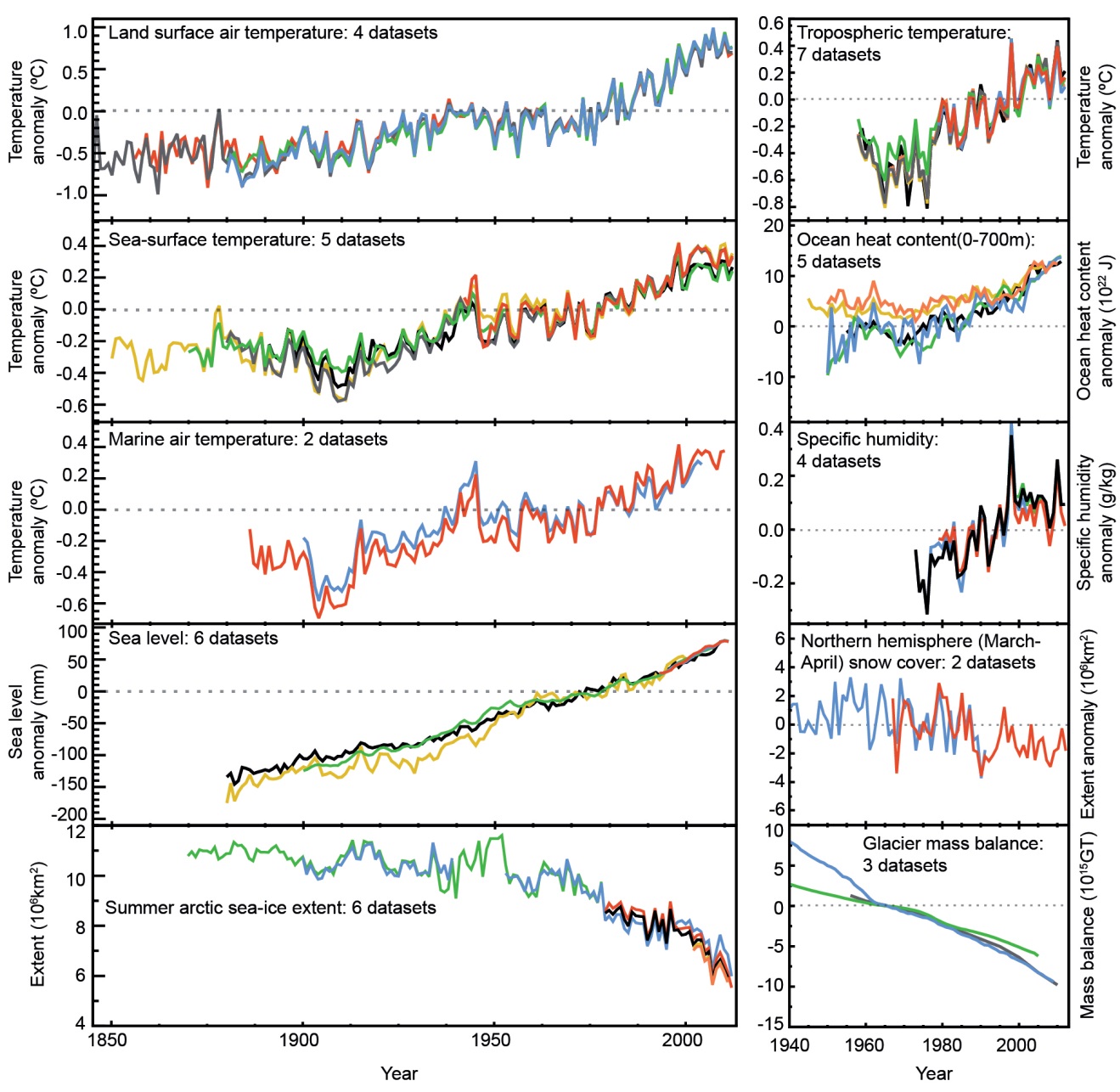
Multiple Examples of A Changing Global ClimateThis illustration is actually ten different sets of data that, when reviewed on their own or taken together show that our planet is warming. Illustrated here are Land Surface Air Temperatures since 1850; Sea Surface Temperatures since 1850; Marine Air Temperatures since the late 1800’s; Sea Level since the late 1880’s; Summer Artic Se-Ice Extent since the 1870’s and in the small charts on the right are Tropospheric Temperatures since the late 1950’s; Ocean Heat Content since the late 1940’s; Specific Humidity since the 1970’s; Northern Hemisphere (March-April) Snow Cover since the 1940’s and, finally, Glacial Mass Balance since the 1940’s. Multiple complementary indicators of a changing global climate. Each line represents an independently derived estimate of change in the climate element. The times series presented are assessed in Chapters 2, 3 and 4. In each panel all data sets have been normalized to a common period of record. Source: CLIMATE CHANGE 2013: THE PHYSICAL SCIENCE BASICS, Working Group I Contribution To The Fifth Assessment Report of the Intergovernmental Panel on Climate Change, Cambridge University Press, 2014 |
Industrialization Leads To Clear Growth In CO2 Production From Fossil Fuels (Gas, Oil & Coal) And Cement ProductionJoni Mitchel explained to writer Alan McDougall that she wrote her song ‘Big Yellow Taxi’ on ‘my first trip to Hawaii. I took a taxi to the hotel and when I woke up the next morning, I threw back the curtains and saw these beautiful green mountains in the distance. Then, I looked down and there was a parking lot as far as the eye could see, and it broke my heart… this blight on paradise. That’s when I sat down and wrote the song’. This chart is fascinating in that it depicts the CO2 produced from fossil fuels and the production of cement of time dating from 1750 to 2011. As you can see, for the first 100 years the amount of CO2 from fossil fuels and cement production is non-existent. However with the start of the first and then second Industrial Revolutions, including the introduction of fossil fueled transportation (trains, ships, cars, trucks and planes) and global construction booms (all of which utilize cement) the volume of CO2 has grown by and to alarming levels. The second chart illustrates the growth of CO2 from Fossil Fuels and Cement Production along with reduced land (called land sink and attributed to deforestation across the globe) as well as the volume of our ocean polluted by CO2 and thus reduced in quality (called ocean sink). Annual anthropogenic CO2 emissions and their partitioning among the atmosphere, land and ocean (PgC yr–1) from 1750 to 2011. (Top) Fossil fuel and cement CO2 emissions by category, estimated by the Carbon Dioxide Information Analysis Center (CDIAC). (Bottom) Fossil fuel and cement CO2 emissions as above. CO2 emissions from net land use change, mainly deforestation, are based on land cover change data. The atmospheric CO2 growth rate prior to 1959 is based on a spline fit to ice core observations and a synthesis of atmospheric measurements from 1959. The fit to ice core observations does not capture the large inter-annual variability in atmospheric CO2 and is represented with a dashed line. The ocean CO2 sink is from a combination of models and observations. The residual land sink (term in green in the figure) is computed from the residual of the other terms. The emissions and their partitioning include only the fluxes that have changed since 1750, and not the natural CO2 fluxes (e.g., atmospheric CO2 uptake from weathering, outgassing of CO2 from lakes and rivers and outgassing of CO2 by the ocean from carbon delivered by rivers) between the atmosphere, land and ocean reservoirs that existed before that time and still exist today. Source: CLIMATE CHANGE 2013: THE PHYSICAL SCIENCE BASICS, Working Group I Contribution To The Fifth Assessment Report of the Intergovernmental Panel on Climate Change, Cambridge University Press, 2014 |


Increases In Carbon Production & Sea Rise Go Hand In HandWhen you view the scientific data on the growth of carbon (CO2) in our oceans versus sea level rise, in both cases here since 1950 through 2011, you see an almost scary correlation between the two. Adding into the illustration the data that has measured the upper ocean’s heat content and the ocean’s salinity levels the trend is nearly, if not, indisputable. The research and conclusions that you can draw from this data and these charts is very compelling. Also compelling is what the IPCC AR5 writers had to say about the impact of CO2 and the heat is produces: The ocean’s large mass and high heat capacity allow it to store huge amounts of energy—more than 1000 times that in the atmosphere for an equivalent increase in temperature. The Earth is absorbing more heat than it is emitting back into space, and nearly all this excess heat is entering the oceans and being stored there. The ocean has absorbed about 93% of the combined heat stored by warmed air, sea, and land, and melted ice between 1971 and 2010. The ocean’s huge heat capacity and slow circulation lend it significant thermal inertia. It takes about a decade for near-surface ocean temperatures to adjust in response to climate forcing, such as changes in greenhouse gas concentrations. Thus, if greenhouse gas concentrations could be held at present levels into the future, increases in the Earth’s surface temperature would begin to slow within about a decade. However, deep ocean temperature would continue to warm for centuries to millennia, and thus sea levels would continue to rise for centuries to millennia as well. Time series of changes in large-scale ocean climate properties. From top to bottom: global ocean inventory of anthropogenic carbon dioxide, updated from Khatiwala et al. (2009); global mean sea level (GMSL), from Church and White (2011); global upper ocean heat content anomaly, updated from Domingues et al. (2008); the difference between salinity averaged over regions where the sea surface salinity is greater than the global mean sea surface salinity (“High Salinity”) and salinity averaged over regions values below the global mean (“Low Salinity”), from Boyer et al. (2009). Source: CLIMATE CHANGE 2013: THE PHYSICAL SCIENCE BASICS, Working Group I Contribution To The Fifth Assessment Report of the Intergovernmental Panel on Climate Change, Cambridge University Press, 2014 |
Sea Level Rise

The Ocean Is Rising (And Faster On the East Coast of the United States Than The West)According to the Union of Concerned Scientist and vast scientific research around the world, seas have risen 8 inches on Earth since 1880. This chart illustrates how much higher sea level is near several American cities between 1963 and 2012 and shows that the Atlantic Ocean and Gulf of Mexico has risen more than the Pacific. |

What Is Causing Sea Level Rise? Two Things Cause 90% of the Problem.According to the Union of Concerned Scientists the answer is that melting land ice is 52% responsible for sea level rise and that another 38% of the cause is from our warming oceans. If you’ve ever combined water with ice, especially warm water, you know that the ice melts. |

Why Is Sea Level Rise Accelerating (Quickly)?Earth’s weather has been getting warmer and warmer. In fact, 2014 was the warmest year on record and scientists are forecasting that our planet will continue to warm in the years and decades to come. How warm the planet gets will impact how quickly glaciers and icebergs melt, and how much they melt, and the forecast is that such melting, and sea rise, will accelerate. In fact some estimates suggest that sea levels could rise 24 to 50 feet over the next six, seven or eight decades. |

Can We Slow Sea Rise?The simple answer is YES but much of the answer depends on what we do and how soon we do it. So much damage has already been done that sea rise over the next 15 to 20 years cannot be stopped but changing our certain things today can slow or stop sea rise in the middle of this century and beyond. But we need to act NOW! |
Glaciers & Icebergs: Our Melting Cyrosphere
Global Sea Level RiseIf you’ve ever seen a chart on sea level rise and predictions for the future chances are it is this one. The volume of science, much less the thousands of scientific writers and reviewers, that supports the IPCC projections that you see here is truly significant. By design the projections that the IPCC, United Nations and associated Countries typically discuss are on the conservative side of the estimates that are illustrated here, in the range of ,03 meters to about 2 meters (approximately 6 feet). It is, however, very possible that the higher range estimates, six meters (about 18 feet above today’s levels) to 8 meters (about 24 feet or so) could take place nearer the end of this century especially if the Greenland ice sheet melting accelerates as some models predict will take place. Projections of global mean sea level rise over the 21st century relative to 1986–2005 from the combination of the CMIP5 ensemble with process-based models, for RCP2.6 and RCP8.5. The assessed likely range is shown as a shaded band. The assessed likely ranges for the mean over the period 2081–2100 for all RCP scenarios are given as colored vertical bars, with the corresponding median value given as a horizontal line.
Source: CLIMATE CHANGE 2013: THE PHYSICAL SCIENCE BASICS, Working Group I Contribution To The Fifth Assessment Report of the Intergovernmental Panel on Climate Change, Cambridge University Press, 2014 |


Historic Sea Levels & Future Level EstimatesThis chart illustrates the actual historic sea level from 1700 as well as future estimates from the IPCC research. What makes this chat even more interesting is that it combines the pale climate (paleo data pre-date measuring instruments and are based on what are called proxy records, meaning a record that is interpreted using physical and biophysical principals, an ice core sample would be one example), tide gauge and altimeter observations of sea rise with the projected global mean sea level (GMSL) change to 2100. Compilation of paleo sea level data (purple), tide gauge data (blue, red and green), altimeter data (light blue) and central estimates and likely ranges for projections of global mean sea level rise from the combination of CMIP5 and process-based models for RCP2.6 (blue) and RCP8.5 (red) scenarios, all relative to pre-industrial values. After the Last Glacial Maximum, global mean sea levels (GMSLs) reached close to present-day values several thousand years ago. Since then, it is virtually certain that the rate of sea level rise has increased from low rates of sea level change during the late Holocene (order tenths of mm yr–1) to 20th century rates (order mm yr–1, Figure TS1). Ocean thermal expansion and glacier mass loss are the dominant contributors to GMSL rise during the 20th century )(high confidence). It is very likely that warming of the ocean has contributed 0.8 [0.5 to 1.1] mm yr–1 of sea level change during 1971–2010, with the majority of the contribution coming from the upper 700 m. The model mean rate of ocean thermal expansion for 1971–2010 is close to observations. Source: CLIMATE CHANGE 2013: THE PHYSICAL SCIENCE BASICS, Working Group I Contribution To The Fifth Assessment Report of the Intergovernmental Panel on Climate Change, Cambridge University Press, 2014 |

Our Planet’s CryosphereOur might know them as the North and South poles or Greenland and Antarctica but to scientists these frigid, frozen, places at the ‘top’ and ‘bottom’ of our planet are known as the cryosphere. Earth’s cryosphere are the regions on or beneath the surface of the Earth and ocean where water is in solid form including sea ice, lake ice, river ice, snow cover, glaciers and ice sheets. Here is what Earth’s cryosphere looks like from space and what each is comprised of today. Source: CLIMATE CHANGE 2013: THE PHYSICAL SCIENCE BASICS, Working Group I Contribution To The Fifth Assessment Report of the Intergovernmental Panel on Climate Change, Cambridge University Press, 2014 |

How Glaciers & Ice Sheets Impact Sea Level RiseThis is an excellent illustration on, and overview about, how melting glaciers and ice sheets impact and influence sea levels. This chart and the accompanying text review the recent IPCC research on what is called the cryosphere, the regions on or beneath the surface of the Earth and ocean where water is in solid form including sea ice, lake ice, river ice, snow cover, glaciers and ice sheets. As the cryosphere is impacted by a warming planet the resulting melting ice causes sea’s to rise. This chart depicts a Chapter’s (4) worth of science from the most recent IPCC AR5 publication on physical science. It reveals a general decline in all components of the cryosphere, but the magnitude of the decline varies regionally and there are isolated cases where an increase is observed. Schematic summary of the dominant observed variations in the cryosphere. The inset figure summarizes the assessment of the sea level equivalent of ice loss from the ice sheets of Greenland and Antarctica, together with the contribution from all glaciers except those in the periphery of the ice sheets. Source: CLIMATE CHANGE 2013: THE PHYSICAL SCIENCE BASICS, Working Group I Contribution To The Fifth Assessment Report of the Intergovernmental Panel on Climate Change, Cambridge University Press, 2014 |

Goodbye Greenland Glaciers?Scientists are certain that the size and volume of glaciers have reduced over the last 100 plus years. The melting ice, in many cases believed to directly be caused by our warming planet and man’s impact in producing CO2, finds its ways into our rivers and oceans. The more water that melts into our oceans the higher the oceans and thus our sea level becomes. There is a very direct correlation between a warming planet, melting ice and, of course, rising seas. There is very high confidence that the Greenland ice sheet has lost ice and contributed to sea level rise over the last two decades (Ewert et al., 2012; Sasgen et al., 2012; Shepherd et al., 2012). The chart below shows the cumulative ice mass loss from the Greenland ice sheet over the period 1992–2012 derived from 18 recent studies made by 14 different research groups (Baur et al., 2009; Cazenave et al., 2009; Slobbe et al., 2009; Velicogna, 2009; Pritchard et al., 2010; Wu et al., 2010; Chen et al., 2011; Rignot et al., 2011c; Schrama and Wouters, 2011; Sorensen et al., 2011; Zwally et al., 2011; Ewert et al., 2012; Harig and Simons, 2012; Sasgen et al., 2012). These studies do not include earlier estimates from the same researchers when those have been updated by more recent analyses using extended data. They include estimates made from satellite gravimetry, satellite altimetry and the mass budget method. In all mountain regions where glaciers exist today, glacier volume has decreased considerably over the past 150 years. Over that time, many small glaciers have disappeared. With some local exceptions, glacier shrinkage (area and volume reduction) was globally widespread already and particularly strong during the 1940s and since the 1980s. However, there were also phases of relative stability during the 1890s, 1920s and 1970s, as indicated by long-term measurements of length changes and by modeling of mass balance. Conventional in situ measurements—and increasingly, airborne and satellite measurements—offer robust evidence in most glacierized regions that the rate of reduction in glacier area was higher over the past two decades than previously, and that glaciers continue to shrink. In a few regions, however, individual glaciers are behaving differently and have advanced while most others were in retreat (e.g., on the coasts of New Zealand, Norway and Southern Patagonia (Chile), or in the Karakoram range in Asia). In general, these advances are the result of special topographic and/or climate conditions (e.g.,increased precipitation). It can take several decades for a glacier to adjust its extent to an instantaneous change in climate, so most glaciers are currently larger than they would be if they were in balance with current climate. Because the time required for the adjustment increases with glacier size, larger glaciers will continue to shrink over the next few decades, even if temperatures stabilize. Smaller glaciers will also continue to shrink, but they will adjust their extent faster and many will ultimately disappear entirely. Cumulative ice mass loss (and sea level equivalent, SLE) from Greenland derived as annual averages from 18 recent studies. Source: CLIMATE CHANGE 2013: THE PHYSICAL SCIENCE BASICS, Working Group I Contribution To The Fifth Assessment Report of the Intergovernmental Panel on Climate Change, Cambridge University Press, 2014 |

Goodbye Antarctica Glaciers?As of today scientist understand less about how glaciers in Antarctica are evolving as compared to those in Greenland. This chart shows the cumulative ice mass loss from the Antarctic ice sheet over the period 1992–2012 derived from recent studies made by 10 different research groups (Cazenave et al., 2009; Chen et al., 2009; E et al., 2009; Horwath and Dietrich, 2009; Velicogna, 2009; Wu et al., 2010; Rignot et al., 2011c; Shi et al., 2011; King et al., 2012; Tang et al., 2012). Overall, there is high confidence that the Antarctic ice sheet is current¬ly losing mass. The average ice mass change to Antarctica from the present assessment has been –97 [–135 to –58] Gt yr–1 (a sea level equivalent of 0.27 mm yr–1 [0.37 to 0.16] mm yr–1) over the period 1993–2010, and –147 [–221 to –74] Gt yr–1 (0.41 [0.61 to 0.20] mm yr–1) over the period 2005–2010. These assessments include the Ant¬arctic peripheral glaciers. There is very high confidence that the largest ice losses are locat¬ed along the northern tip of the Antarctic Peninsula where the collapse of several ice shelves in the last two decades triggered the acceleration of outlet glaciers, and in the Amundsen Sea, in West Antarctica. On the Antarctic Peninsula, there is evidence that precipita¬tion has increased (Thomas et al., 2008a) but the resulting ice-gain is insufficient to counteract the losses (Wendt et al., 2010; Ivins et al., 2011). There is medium confidence that changes in the Amundsen Sea region are due to the thinning of ice shelves (Pritchard et al., 2012), and medium confidence that this is due to high ocean heat flux (Jacobs et al., 2011), which caused grounding line retreat (1 km yr–1) (Joughin et al., 2010a) and glacier thinning (Wingham et al., 2009). Indications of dynamic change are also evident in East Antarctica, primarily around Totten Glacier, from GRACE (Chen et al., 2009), altimetry (Wingham et al., 2006; Shepherd and Wingham, 2007; Pritchard et al., 2009; Fla¬ment and Remy, 2012), and satellite radar interferometry (Rignot et al., 2008b). The contribution to the total ice loss from these areas is, however, small and not well understood. Cumulative ice mass loss (and sea level equivalent, SLE) from Antarctica derived as annual averages from 10 recent studies. Source: CLIMATE CHANGE 2013: THE PHYSICAL SCIENCE BASICS, Working Group I Contribution To The Fifth Assessment Report of the Intergovernmental Panel on Climate Change, Cambridge University Press, 2014 |
SOUTH FLORIDA MAPS: Sea Level Rise Projections
 |
 |
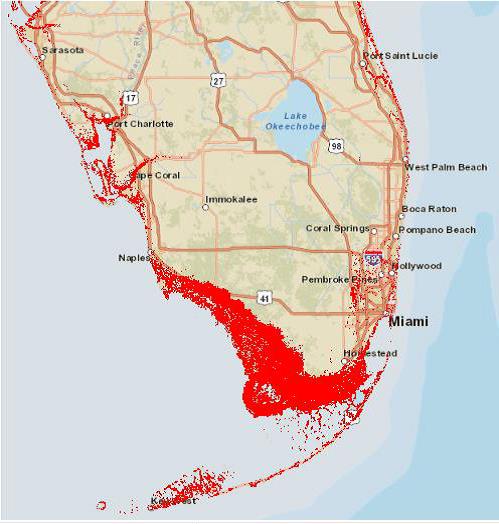 |
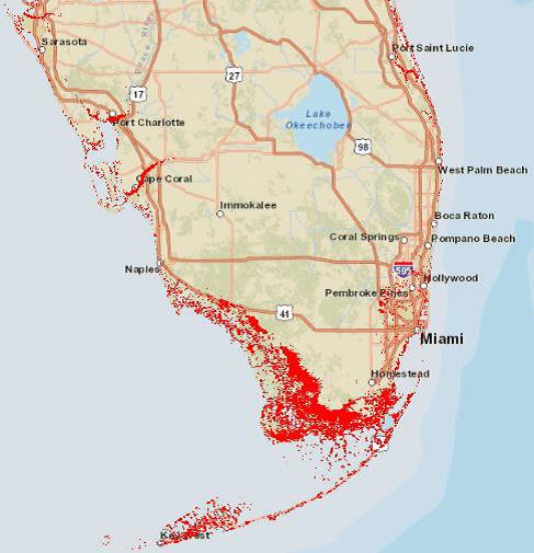
| 15 years & seven inches | 45 years & 24 inches | 85 years & 36 inches |